

28 Best Paint Colors for Small Nursery Rooms
Designing a small nursery room can feel challenging — you want it to be cozy yet not cramped, stylish yet practical, and bright enough for daytime play while calm enough for bedtime. One of the most powerful tools you have to achieve this balance is paint color.
The right color can visually expand a space, make it feel brighter, and even influence your baby’s mood. Soft neutrals create a timeless backdrop, pastels bring warmth and charm, and airy tones help a room feel larger than it is. Even in tiny spaces — whether you have a corner nook in your bedroom, a compact standalone room, or a shared space — choosing the right color can transform the environment from “small and plain” to “cozy and magical.”
In this guide, we’ll explore 28 of the best paint colors for small nursery rooms — each with a description of why it works, how it can make your nursery feel more spacious, and styling tips to bring your small nursery room ideas to life.
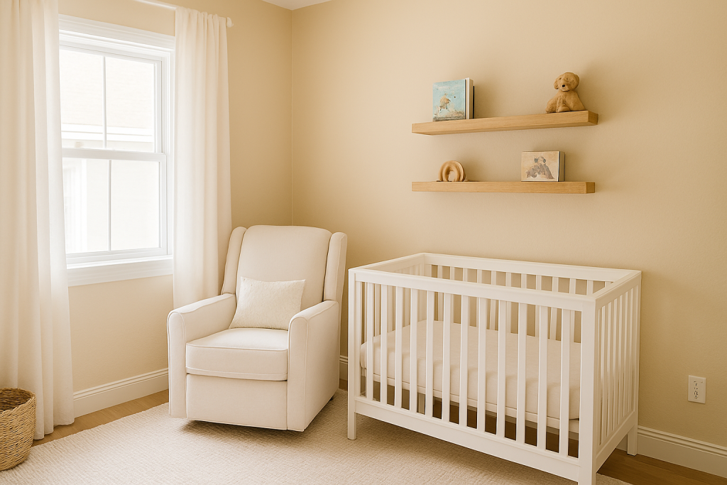
1. Soft White
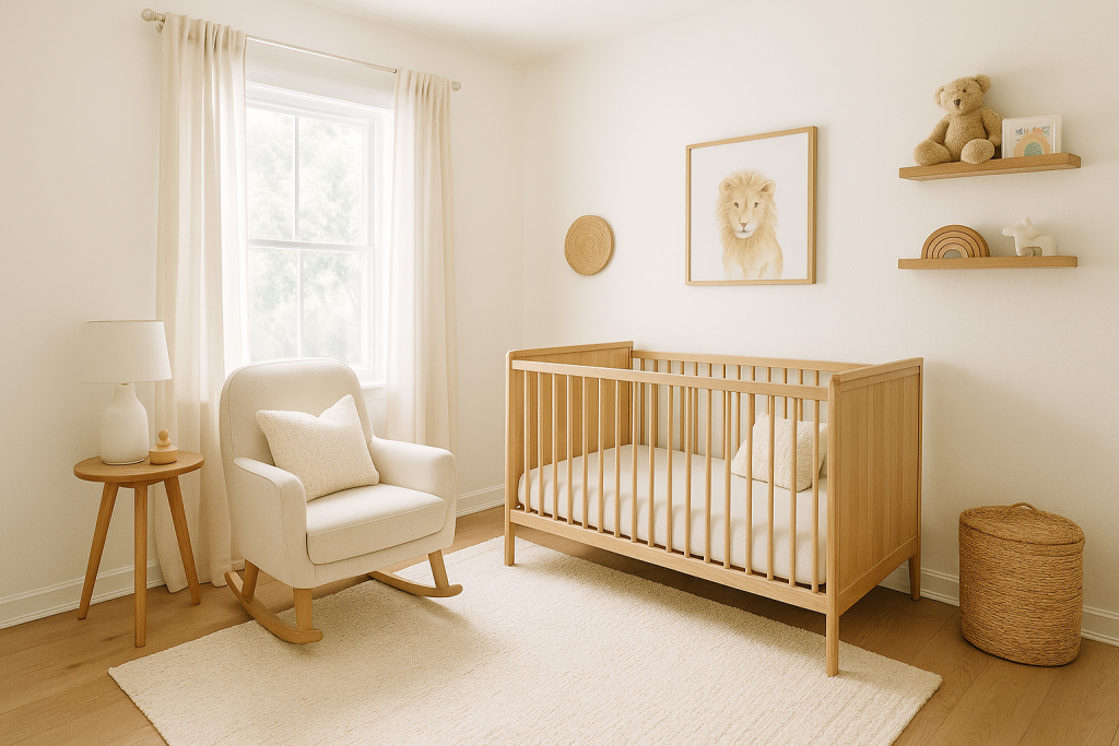
Soft white is a classic choice for small nurseries because it reflects natural and artificial light, making the room appear larger and more open. Unlike stark white, which can feel cold, soft white has subtle warmth, creating a cozy yet airy feel.
Why it works: It’s a blank canvas that pairs with any nursery theme — from modern minimalist to boho chic.
Styling tip: Pair with light wood furniture and woven textures for a warm, Scandinavian-inspired look. Add pops of color through rugs, wall art, and bedding.
2. Warm Ivory
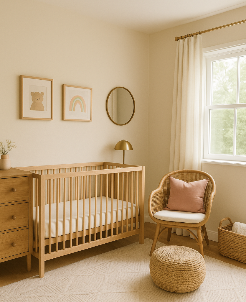
Warm ivory is ideal if you want a neutral tone with a touch of warmth. It’s slightly creamier than white, giving the space a gentle, inviting glow.
Why it works: Ivory keeps the room bright while avoiding the clinical feel of pure white.
Styling tip: Combine with gold accents, rattan furniture, and pastel decor for a serene, gender-neutral nursery.
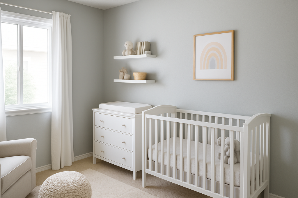
3. Pale Gray
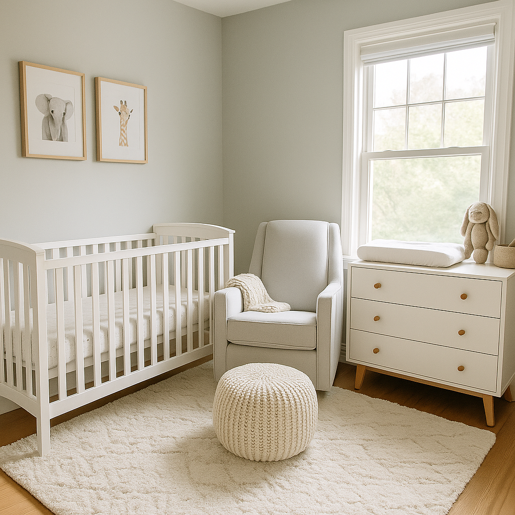
Pale gray offers a modern, sophisticated look without making the room feel small. Its cool undertones can balance bright sunlight, preventing glare.
Why it works: Gray is versatile, working beautifully with pinks, blues, and greens.
Styling tip: Add soft textures like chunky knit blankets and plush rugs to keep the space from feeling too cold.
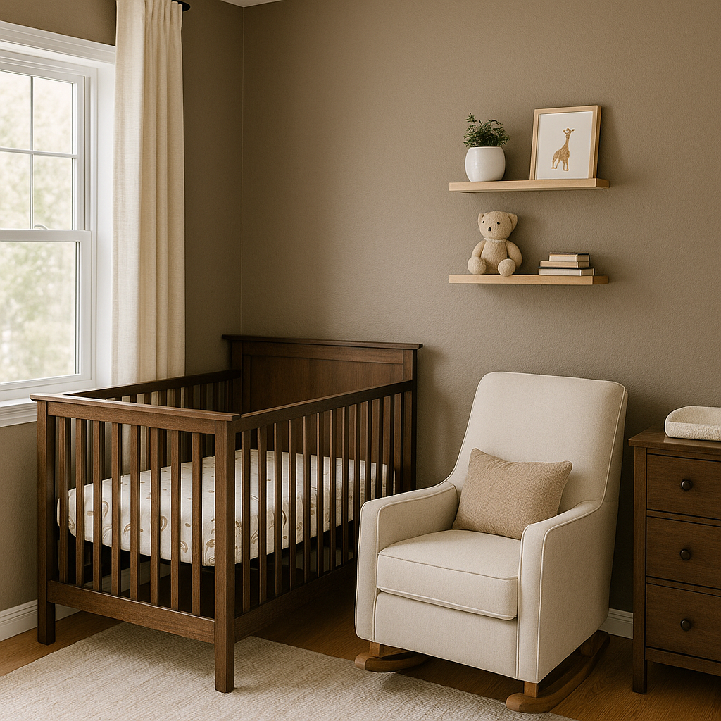
4. Greige (Gray + Beige)
Greige is the perfect marriage of warm beige and cool gray, giving your nursery depth without overwhelming the space.
Why it works: It’s warm enough for coziness yet modern enough for contemporary styles.
Styling tip: Pair with white trim and natural textures like linen curtains and bamboo shelves.
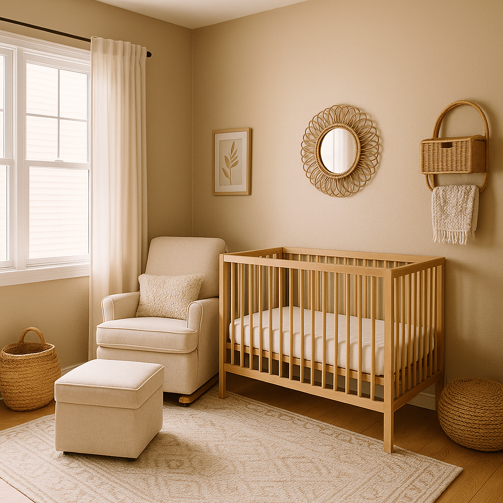
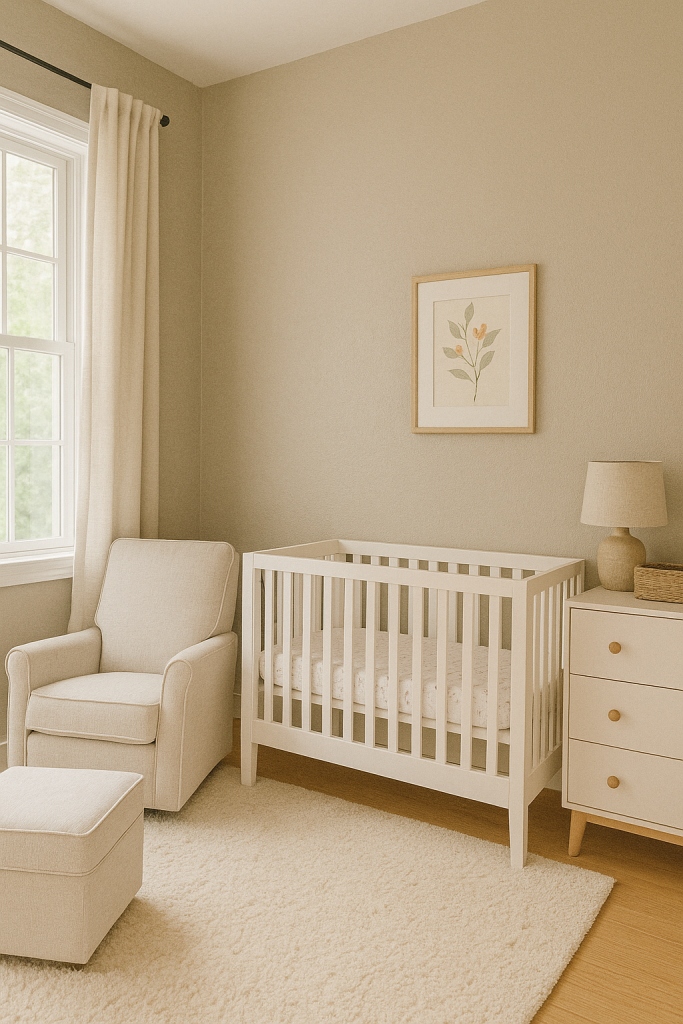
5. Soft Beige
Soft beige is warm, calming, and timeless — perfect for creating a nurturing environment in a small nursery.
Why it works: Its natural tone makes it easy to coordinate with any furniture color.
Styling tip: Add layers of white and cream to keep the look bright and airy.
6. Blush Pink
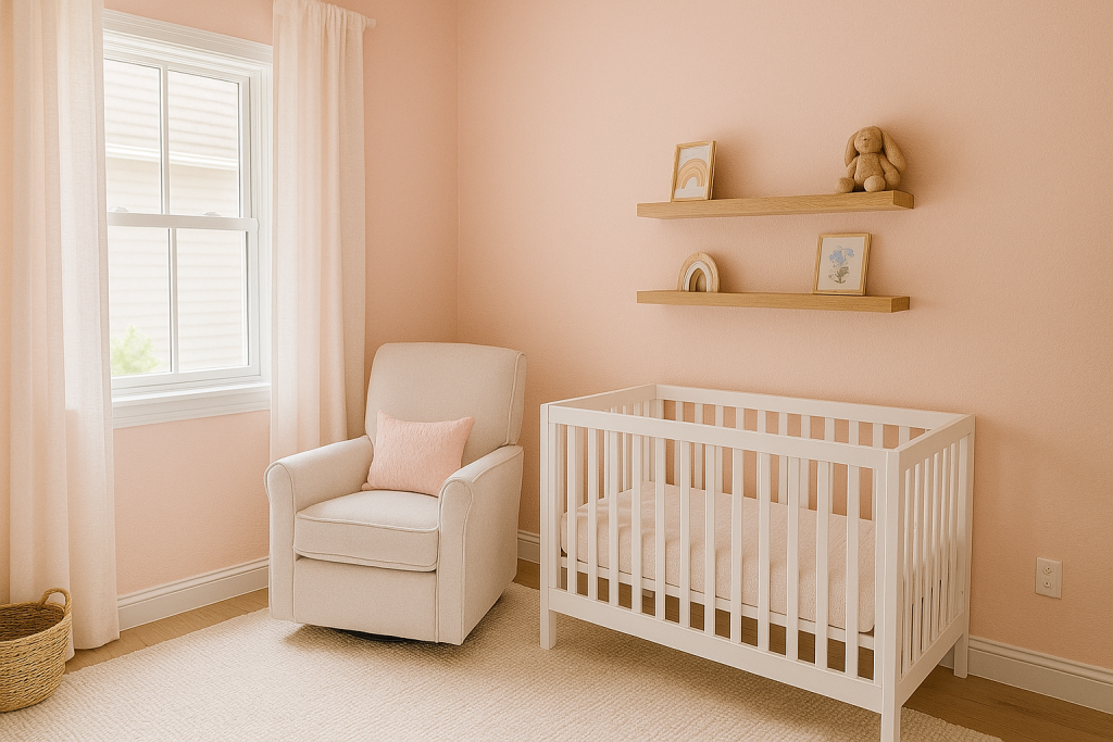
Blush pink adds warmth and sweetness without being overly bright. It’s perfect for a feminine touch or a modern, muted pastel palette.
Why it works: It gives a soft glow that makes a small nursery feel cozy and welcoming.
Styling tip: Combine with gold or brass hardware and soft gray accents for a sophisticated twist.
7. Dusty Rose

Dusty rose is a muted pink with a vintage feel — warm yet subtle, perfect for a nursery that will grow with your child.
Why it works: It adds character without overpowering the room.
Styling tip: Pair with floral prints, antique-style furniture, and cream accessories.
8. Peachy Nude
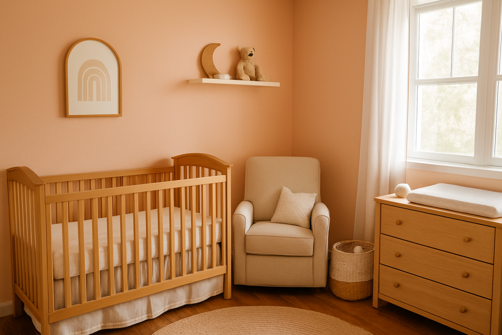
Peachy nude is a cheerful, warm tone that works beautifully in small spaces.
Why it works: The peach undertones make it uplifting and sunny.
Styling tip: Mix with white trim, light oak furniture, and neutral bedding for a balanced look.
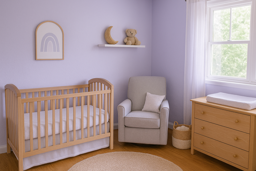
9. Pale Lavender
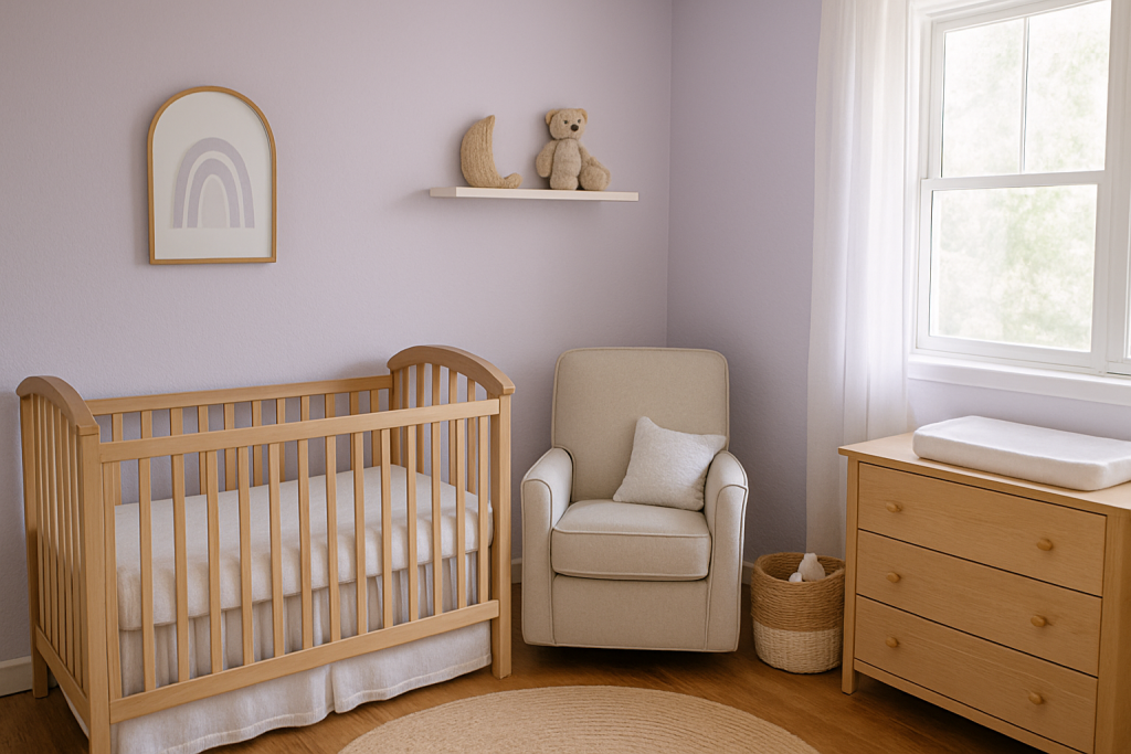
Pale lavender offers a dreamy, calming vibe — perfect for winding down at bedtime.
Why it works: It’s soothing without being too sweet.
Styling tip: Pair with white or silver accents for a clean, airy aesthetic.
10. Lilac Mist
Lilac mist is a slightly cooler take on lavender, giving your nursery a sophisticated yet whimsical look.
Why it works: The soft purple hue creates a sense of tranquility and space.
Styling tip: Combine with gray or blush decor for a layered pastel palette.
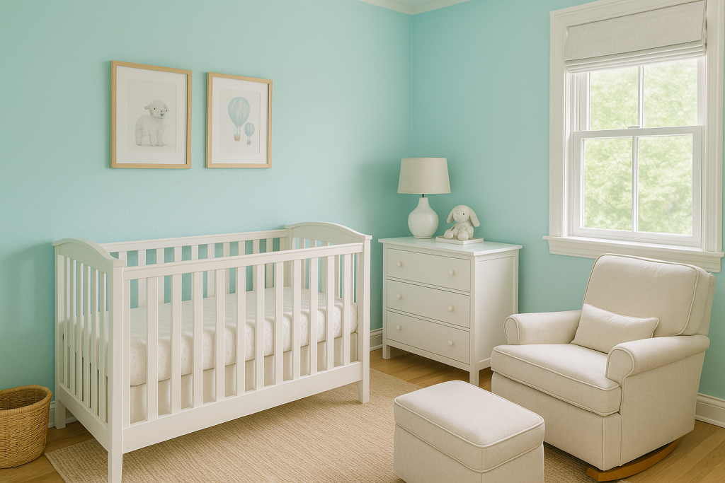
11. Mint Green
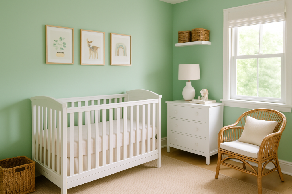
Mint green is refreshing and light, making small rooms feel open and airy.
Why it works: Its cool undertones keep the space crisp without feeling cold.
Styling tip: Pair with white furniture and wicker baskets for a fresh, springtime vibe.
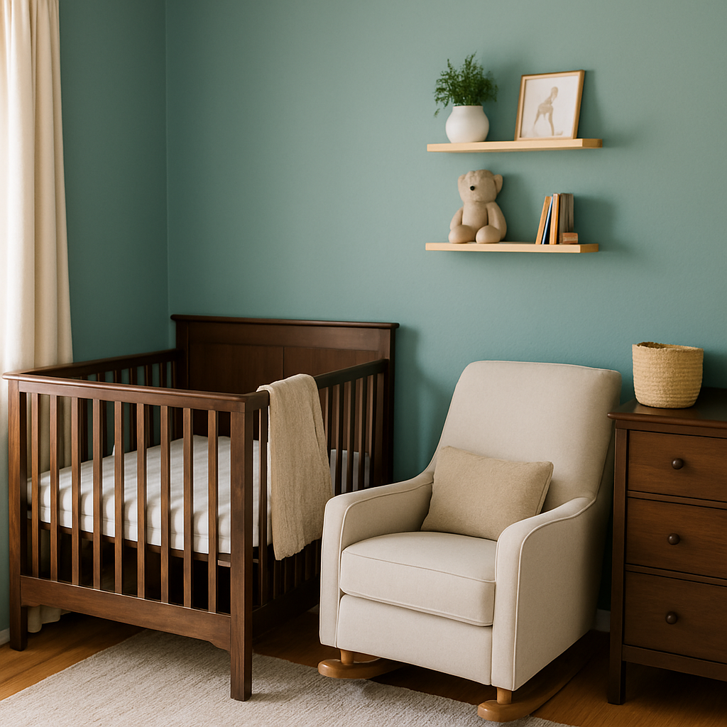
12. Sage Green
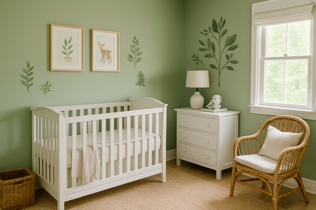
Sage green is an earthy, muted green that’s both calming and modern.
Why it works: It’s gender-neutral and pairs well with natural materials.
Styling tip: Use with wood tones and leafy wall decals for a nature-inspired nursery.
13. Seafoam Green
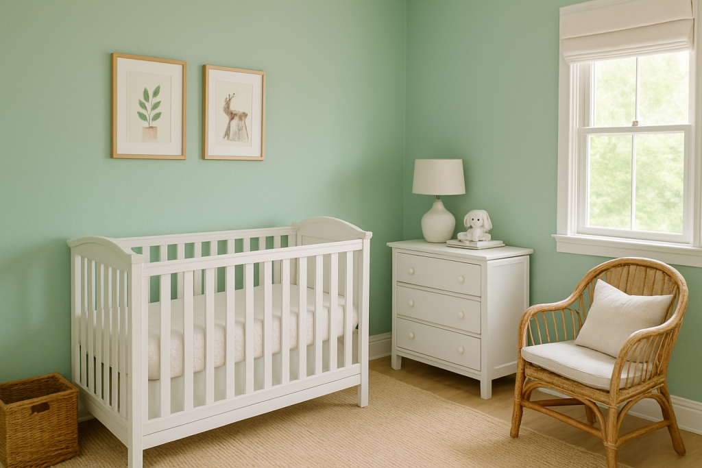
Seafoam green brings a soft, coastal feel to your nursery.
Why it works: The gentle blue-green tone expands visual space.
Styling tip: Mix with sandy beige rugs and light wood accents for a beachy feel.
14. Light Aqua
Light aqua is cheerful yet soothing — a perfect balance for a nursery.
Why it works: It reflects light beautifully, keeping the space airy.
Styling tip: Combine with crisp white trim and pastel decor for a playful look.
15. Sky Blue
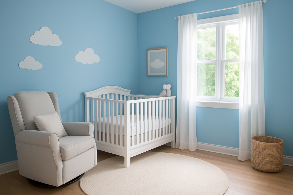
Sky blue mimics the openness of the sky, making your nursery feel larger.
Why it works: It’s peaceful, timeless, and works with many themes.
Styling tip: Add cloud decals or white curtains for a dreamy look.
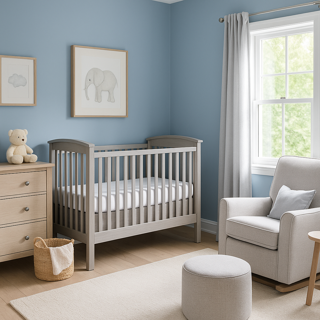
16. Powder Blue
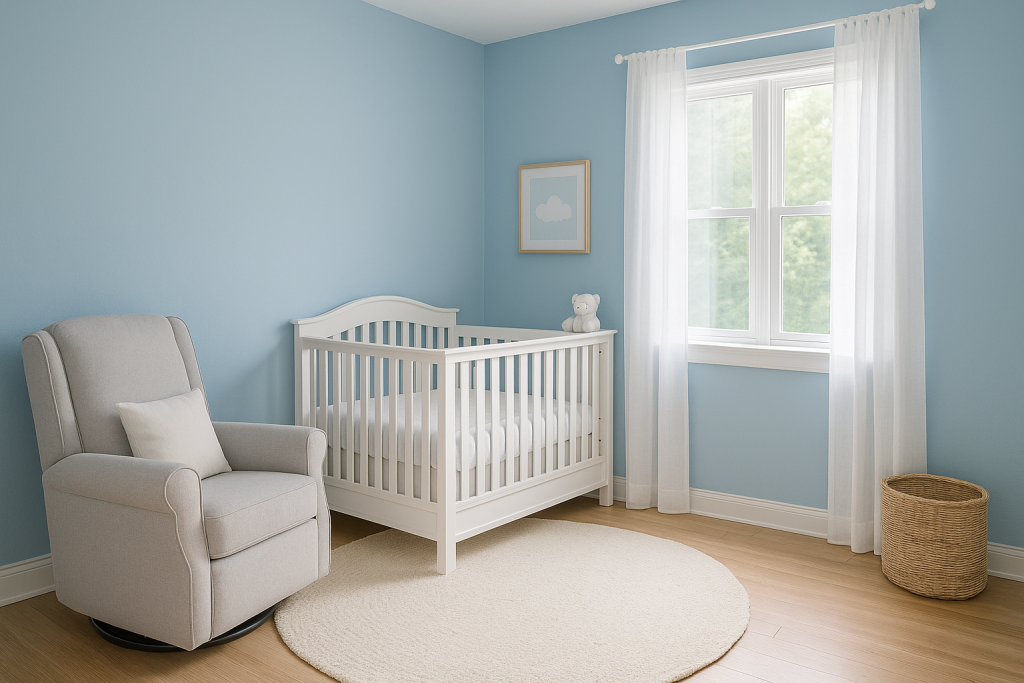
Powder blue offers a softer, more muted version of blue, perfect for a calm nursery environment.
Why it works: It doesn’t overwhelm small spaces while still adding color.
Styling tip: Pair with white furniture and silver accents for a serene space.
17. Soft Teal
Soft teal adds depth while remaining gentle enough for a nursery.
Why it works: It’s colorful yet still calming.
Styling tip: Use with cream textiles and natural wood to balance the richness.
18. Warm Taupe
Warm taupe is sophisticated and earthy, adding depth without making the space feel heavy.
Why it works: It’s a perfect neutral for small, cozy spaces.
Styling tip: Pair with off-white and subtle metallic accents for elegance.
19. Sandstone Beige
Sandstone beige has a natural, organic tone that works beautifully with boho nursery styles.
Why it works: It adds warmth while keeping the space light.
Styling tip: Add rattan, macrame, and layered rugs for texture.
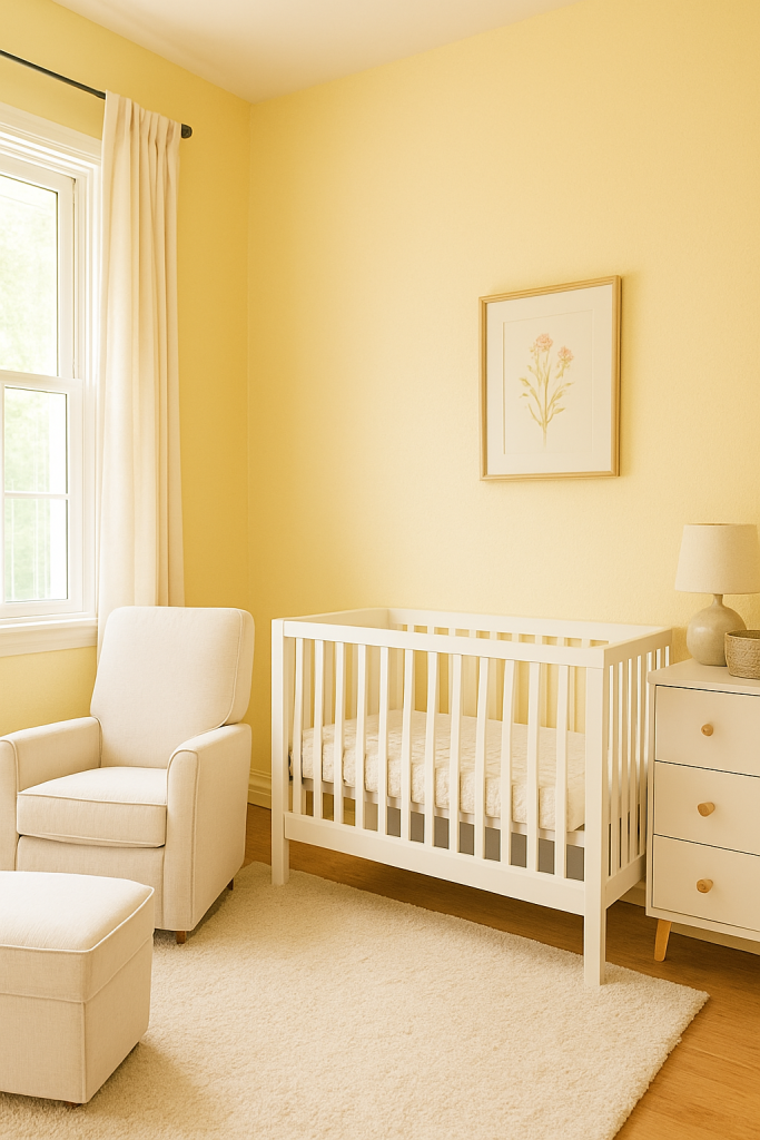
20. Pale Yellow
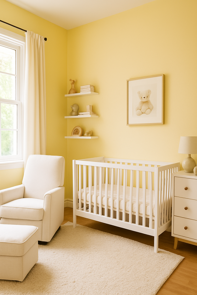
Pale yellow adds sunshine and cheer to small nurseries without being too bright.
Why it works: It brings warmth and energy to limited spaces.
Styling tip: Use with white trim and soft pastel accessories.
21. Buttercream
Buttercream is a soft, creamy yellow that feels cozy and welcoming.
Why it works: It has a warm undertone that works well with wood furniture.
Styling tip: Pair with floral bedding and light curtains for a vintage feel.
22. Pale Coral
Pale coral offers a playful yet soft look, adding warmth without intensity.
Why it works: It livens up a room without feeling too bold.
Styling tip: Mix with white, mint, or blush for a fresh, modern palette.
23. Soft Terracotta
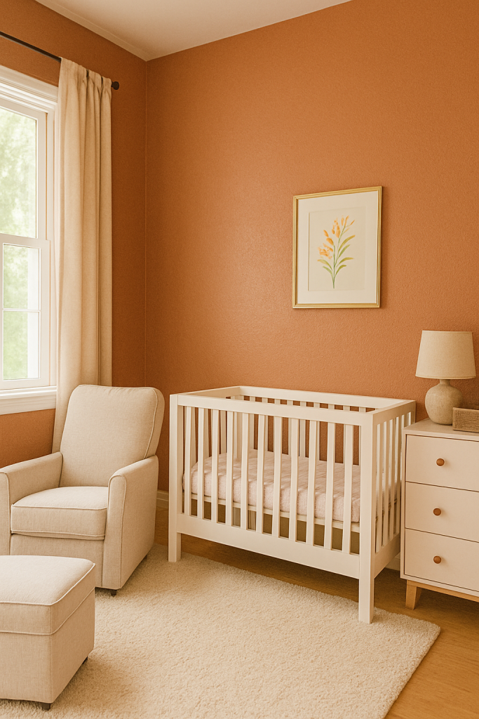
Soft terracotta adds earthy warmth, perfect for creating a grounding, cozy nursery.
Why it works: It’s warm but muted, making it great for small rooms.
Styling tip: Combine with beige and natural wood accents.
24. Light Mushroom
Light mushroom is a chic, grayish beige that works with almost any style.
Why it works: It’s a flexible neutral that makes small spaces feel elegant.
Styling tip: Add white trim and textured textiles for depth.
25. Misty Blue
Misty blue is a gray-blue that brings a calm, sophisticated feel.
Why it works: It’s cool and airy without being stark.
Styling tip: Pair with light gray furniture and silver decor.
26. Cool Silver
Cool silver is a pale gray with reflective qualities that bounce light around the room.
Why it works: It gives a modern yet soft look.
Styling tip: Mix with white and pastel accents for a clean, fresh vibe.
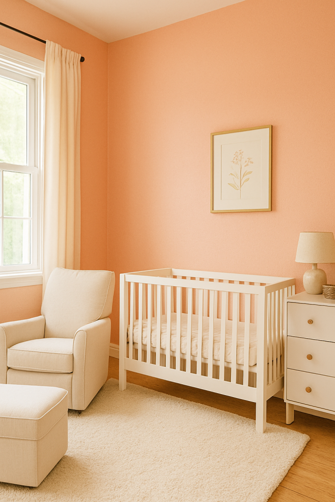
27. Pale Peach
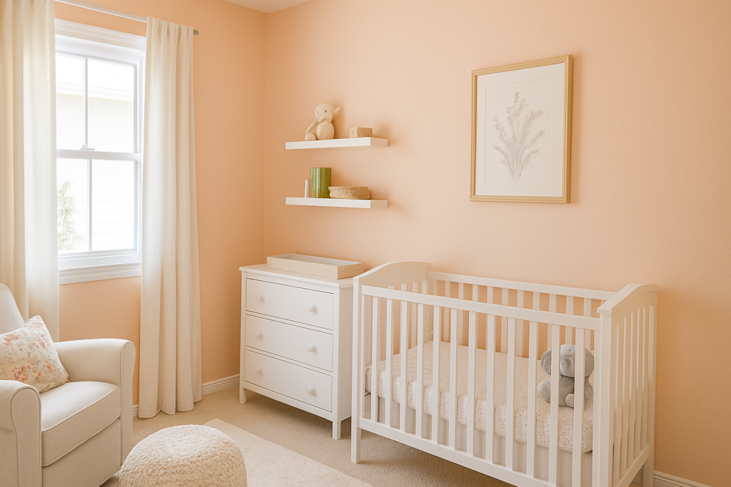
Pale peach is warm and sweet, creating a joyful yet gentle nursery environment.
Why it works: It’s cheerful but still subtle enough for small spaces.
Styling tip: Pair with cream furniture and floral patterns.
28. Crisp Linen
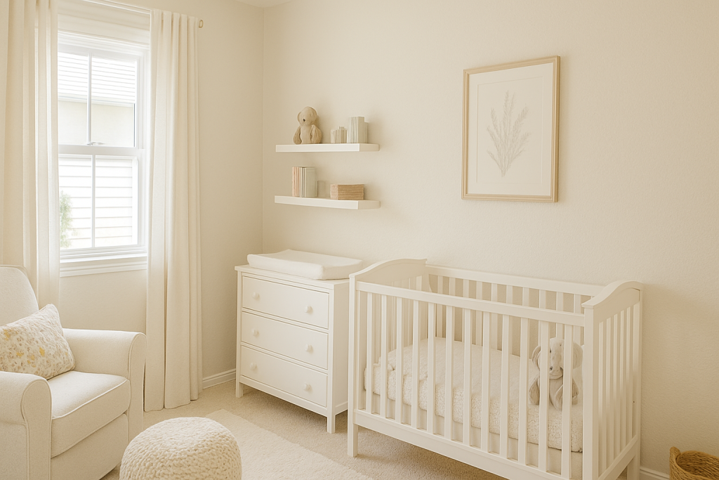
Crisp linen is an off-white with soft beige undertones — timeless and versatile.
Why it works: It brightens without the starkness of pure white.
Styling tip: Add woven storage baskets and neutral textiles for a cozy touch.
Final Thoughts
Choosing the perfect paint color for your small nursery room is more than just a style decision — it’s about creating an environment where your baby feels safe, calm, and loved. Light, soft tones visually expand your space, while warm, earthy shades create a cocoon-like coziness. The colors above offer a wide range of options to suit every style and mood, whether you want something timeless and neutral or playful and modern.
Pair your chosen color with clever small nursery room ideas — such as vertical storage, multi-functional furniture, and soft layered lighting — to make your compact nursery functional, beautiful, and truly magical.


